Refresh your home's color palette with warm, earthy, or saturated tones to warm up your interior during the cooler months ahead. Today I will be sharing a combination of color pairings and how to incorporate these shades into your home.
I am going to break this post into personal color preferences: Neutral, Playful, and Bold .. Scroll down to the color palette that you gravitate to.
For the Neutral Lover
If you love neutral colors, try incorporated shades of "Cognac" into your home. Warm whisky browns that have a reddish tint pair well with other neutral shades. The warm autumn shade can be incorporated with wood furniture finishes and/or fabrics like the warm whiskey brown chairs featured in this eclectic living space.
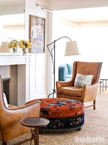
(Image via House Beautiful)
Taupe and mink brown are a great choice to use as neutral to balance any color palette. I prefer taupe over gray because it is earthy and creates a warm inviting environment when used on walls. (Love taupe so much that it is my current Fall nail color right now)
If you are searching for a muted color, try using mauve in your home. Mauve is a toned down purple that compliments well with warm browns, deep plums, and crisp whites.
Blush pinks and soft rose shades are colors that can be worked into your home. They marry well with rich blues or beiges and creams. For paint colors, select a white with a tint of flesh tone pink for a touch of warmth to a crisp white.
For a deeper neutral color and an alternative to dark brown, try experimenting with the color "Marsala". Marsala is a rich brown-red hue and also the Pantone 2015 Color of the Year. Definitely one of my favorite shades. I love how the marsala sectional grounds the space in the photo below. Read more about this color in detail.

(Image via Belgian Pearls)
For the Playful and Cheery
If you like bright cheery tones, use Pantone's "misted yellow" which is a muted yellow with a green tint. It is the fall version of a cheery yellow. If you are looking for a yellow without the green tint, I like using mustard as an accent color in accessories or fabrics. Mustard marries well with rich brown, vibrant teal, charcoal gray, and even black.
(Image via Digdigs.com)
Another cheery pop of color to try is Pantone's Amethyst Orchid. A vibrant jewel tone that is strong enough to be a statement color or can be used sparingly with accessories or flowers. Amethyst Orchid can add a lot of energy to a space when paired with red or another vibrant hue but when combined with gray it adds a soft playful pop of color.
Cypress green is a color that I am seeing more lately. I've seen it on walls, furniture, and even kitchen cabinets. Cypress is a soft soothing green but when mixed with a neutral color palette it can add a crisp pop of color. As the leaves begin to fade, shades of green can evoke a feeling of nature when added into your home. Cypress green and forest green are two shades to experiment with this winter.
For the Bold and Daring
If you are feeling daring and want to explore using saturated hues, here are a few:
Aurora red: A cross between orange and red. Reminiscent in the fall leaves. This shade is perfect for Autumn shade. Whether you use this shade in small ways or big ways, this color is bound to make a statement due to the density in color.
Pumpkin: If you aren't ready for the commitment of red, try using shades of pumpkin or a paprika spice. Burnt oranges add warmth to charcoal grays and compliment taupe or chocolate browns. In the photo below, the pumpkin hue adds warmth and color to this cozy bedroom but isn't overpowering.

(Image via Ericcrossinteriors.com)
Not quite blue, not quite green: Teal is a beautiful gem tone that is vibrant and mixes well with warm shades like whiskey brown. I love how the mid-century modern chair pops against the rich teal walls.

(Image via mod-home.info)
Rich violet, Sangria-like shades are rich shades that can create intimate settings when used on walls. I love seeing deep violet or cabernet-like shades in dining rooms. I feel like it creates a warm dinner setting. Whether used in a big way on walls or in smalls doses, this shade is sure to warm up any space.
So which shade will you be experimenting with this fall? Will you be going for a cheery, bold, or neutral look? Comment below :)
Want more design tips? Join "The Designed Life" monthly e-magazine, filled with tons of inspiration for the home and life. Also, receive a free Home Design Checklist to make your next shopping trip for your home easier.