


Tell me if this sounds familiar: You just moved in or are looking for a new home, you started shopping around online, you made Pinterest & Houzz inspiration boards, you bookmarked all your favorite items, you watched reruns of HGTV shows, you took notes from a YouTube video on how to DIY everything, and you have been stock piling coupons for Bed Bath and Beyond like nobody's business. You did the research and you gathered inspiration but where do you start? I’m here to tell you how in this blog post!
Experiment with Color: Fall 2015 Trends
Refresh your home's color palette with warm, earthy, or saturated tones to warm up your interior during the cooler months ahead. Today I will be sharing a combination of color pairings and how to incorporate these shades into your home. I am going to break this post into personal color preferences: Neutral, Playful, and Bold .. Scroll down to the color palette that you gravitate to.
For the Neutral Lover
If you love neutral colors, try incorporated shades of "Cognac" into your home. Warm whisky browns that have a reddish tint pair well with other neutral shades. The warm autumn shade can be incorporated with wood furniture finishes and/or fabrics like the warm whiskey brown chairs featured in this eclectic living space.
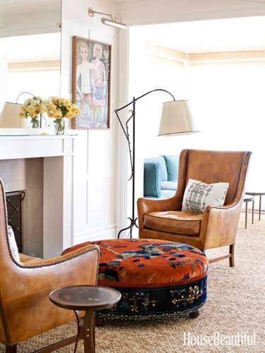
(Image via House Beautiful)
Taupe and mink brown are a great choice to use as neutral to balance any color palette. I prefer taupe over gray because it is earthy and creates a warm inviting environment when used on walls. (Love taupe so much that it is my current Fall nail color right now)
If you are searching for a muted color, try using mauve in your home. Mauve is a toned down purple that compliments well with warm browns, deep plums, and crisp whites.
Blush pinks and soft rose shades are colors that can be worked into your home. They marry well with rich blues or beiges and creams. For paint colors, select a white with a tint of flesh tone pink for a touch of warmth to a crisp white.
For a deeper neutral color and an alternative to dark brown, try experimenting with the color "Marsala". Marsala is a rich brown-red hue and also the Pantone 2015 Color of the Year. Definitely one of my favorite shades. I love how the marsala sectional grounds the space in the photo below. Read more about this color in detail.

(Image via Belgian Pearls)
For the Playful and Cheery
If you like bright cheery tones, use Pantone's "misted yellow" which is a muted yellow with a green tint. It is the fall version of a cheery yellow. If you are looking for a yellow without the green tint, I like using mustard as an accent color in accessories or fabrics. Mustard marries well with rich brown, vibrant teal, charcoal gray, and even black.
(Image via Digdigs.com)
Another cheery pop of color to try is Pantone's Amethyst Orchid. A vibrant jewel tone that is strong enough to be a statement color or can be used sparingly with accessories or flowers. Amethyst Orchid can add a lot of energy to a space when paired with red or another vibrant hue but when combined with gray it adds a soft playful pop of color.
Cypress green is a color that I am seeing more lately. I've seen it on walls, furniture, and even kitchen cabinets. Cypress is a soft soothing green but when mixed with a neutral color palette it can add a crisp pop of color. As the leaves begin to fade, shades of green can evoke a feeling of nature when added into your home. Cypress green and forest green are two shades to experiment with this winter.
For the Bold and Daring
If you are feeling daring and want to explore using saturated hues, here are a few:
Aurora red: A cross between orange and red. Reminiscent in the fall leaves. This shade is perfect for Autumn shade. Whether you use this shade in small ways or big ways, this color is bound to make a statement due to the density in color.
Pumpkin: If you aren't ready for the commitment of red, try using shades of pumpkin or a paprika spice. Burnt oranges add warmth to charcoal grays and compliment taupe or chocolate browns. In the photo below, the pumpkin hue adds warmth and color to this cozy bedroom but isn't overpowering.

(Image via Ericcrossinteriors.com)
Not quite blue, not quite green: Teal is a beautiful gem tone that is vibrant and mixes well with warm shades like whiskey brown. I love how the mid-century modern chair pops against the rich teal walls.

(Image via mod-home.info)
Rich violet, Sangria-like shades are rich shades that can create intimate settings when used on walls. I love seeing deep violet or cabernet-like shades in dining rooms. I feel like it creates a warm dinner setting. Whether used in a big way on walls or in smalls doses, this shade is sure to warm up any space.
So which shade will you be experimenting with this fall? Will you be going for a cheery, bold, or neutral look? Comment below :)
Want more design tips? Join "The Designed Life" monthly e-magazine, filled with tons of inspiration for the home and life. Also, receive a free Home Design Checklist to make your next shopping trip for your home easier.
Design Trend: Blue Hues in Home Decor
Boy oh boy, do I have the case of the blues (not the boo-hoo blues)!! Shades of blue were introduced at High Point Market this Spring. In the fashion industry, Pantone may have announced "Marsala" to be the fashion color of the year but blue is the color of the year in furniture, accessories, and home decor as well. Today I will be sharing my inspiration and home decor in bright blues that you can add to your home and reinvent your space.

If you follow me on Instagram, I shared my inspiration of a vignette with vibrant blue plantation shutters and moroccan tile around it. Pigmented blue hues ranging from royal to indigo to watery azure are trending for this season on the runway and in home decor.
Introduce shades of blue to any decorating palette in doses or as the main focus. Blue plays well off of primary colors such as yellow or red for a bold impact. Pair blue with orange for a energetic color combo. On the contrary, couple blue hues with purple or green for soothing and cool palette. Blue could also serve as an accent color when paired with neutrals like the room featured below.
 (Photo via 6th Street Design School)
Whether you choose to add vibrant blue tones in big way or subtle way, I have found a few options that will suit your decor needs. Here are some blue decor ideas that you can incorporate into your home.

1. Silk Pillow // 2. Cobalt Table Lamp // 3. Porcelain Chinoiserie Vase // 4. Indigo Scarf // 5. Tufted Sofa // 6. Botanical Watercolor Art // 7. Hall Chest // 8. Ikat Rug
Did you find something you liked? Pin this image to your Pinterest board so you can shop later. Are you following me on Pinterest? Let's be friends :)
http://pinterest.com/byamadesigns/
For current photos of my work and progress photos, follow AMA Designs on Facebook or Instagram.
Want more design tips? Join "The Designed Life" monthly e-magazine, filled with tons of inspiration for the home and life. Also, receive a free Home Design Checklist to make your next shopping trip for your home easier.
How to Add Color to your Space for Spring!
It's officially Spring and okay, I admit - I've got Spring fever! Woot woot! What I love about spring is bright cheery colors so today I will be discussing how to incorporate color into your home with ease! You can add color into your space with either soft pastels or bold colored accents. Whatever side of the color spectrum you choose, it will still breath life into your space. Bold colors are more energizing and pastel colors are soothing to the eye yet welcoming. I love bright colors balanced by neutrals. Use a neutral color as a background then layer color on top for a look that you won't grow tired of.
Explore color and find out what colors work for your home and personality. Don't know where to start? Take a look at your wardrobe, you tend to gravitate toward your favorite colors.
How to Add Color to Your Space
1. Decorative Accents - I love adding color and switching out color with decorative accents such as picture frames, candle holders, and vases (inexpensive ones that you can pick up at Target or Home Goods).
[houzz=http://www.houzz.com/photos/14550183/Walnut-Creek-Bungalow-living-room-san-francisco]
2. Area Rugs - Mix in area rugs with a colorful pattern to amplify your entry way or kitchen. You can even add a bright mat to your laundry room to boost your mood when folding your clothes.
[houzz=http://www.houzz.com/photos/18608984/2014-Parade-Home-Lehi-transitional-entry-salt-lake-city]
3. Accent Pillows - Now that is getting warmer out, all the bright colors are out in stores. It makes me so happy! Not only can you add playful pillows indoors but outdoors too! Outdoor pillows make your backyard more inviting. The color and pattern draws your eye outside, making that lounge chair look super tempting to lay on!
[houzz=http://www.houzz.com/photos/9428265/2013-Coastal-Living-Showhouse-beach-style-bedroom-atlanta]
4. Stationary - Is your work area feeling tired? Brighten it up with colorful stationary. Notepads, pens, storage boxes, and file holders can cheer up your desk.
5. Flowers - What is Spring without flowers? Place flowers (or faux flowers) in areas of your home that you will see them often. There is something about flowers that make your home feel extra special. Even if they are fake, flowers can add elegance and color into your space subtly.
[houzz=http://www.houzz.com/photos/2550186/wwwmyplumdesigncom-transitional-family-room-toronto]
6. Fresh Paint - Give an old piece of furniture a new look with a fresh coat of paint.
I hope you found these 6 tips to add color into your home helpful! Which tip was your favorite? Please share below! I would love to hear from you.
Love my blog and design tips? Join my monthly newsletter and become an A-List Member. All members receive a free gift when you join!
Travel Tuesday: Morroco
I travel all the time to exotic and magical places...... through pictures. It is my dream to travel the world. I want to experience other cultures, try new foods, and absorb all the design details during my journey. For now, I will continue exploring through pictures. Surely it isn't the same and not nearly as fun.. but still inspiring. I am so mesmerized by Moroccan architecture. I can't begin to imagine how much time it takes to tile colorful mosaics throughout the walls and floors of hallways. The intricate detail that is involved is absolutely breath taking.
Here are just a few pictures that inspired me. What is your dream travel destination? Share with me below :)


The New Neutrals for 2014
This Spring , we will be seeing more pastels according to Pantone and Benjamin Moore, In interiors, we will be seeing less gray, and more cool blues, lavenders, pinks, and soft greens. It is a great way to add color to your walls without being in your face. A pastel color pallet will still highlight your artwork and additional pieces in your home while making your room feel happy and bright.
When I say pastels, they are not your typical "Easter Egg" colors. Pantone and Benjamin Moore have both introduced a new twist to pastels. Benjamin Moore says its the "new neutrals".
Aside from pastels, I am seeing a huge color trend in fashion, design, and graphics. Other colors that I am sure will make an entrance this year will be rich russet tones, paprika, coral, saffron, cobalt blue, peacock blue, and eggplant. Mixing one of these colors with a pastel could be absolutely stunning in your home or even an outfit! Be adventurous this year and experience with color!
For more reading on the color predictions for this year visit;
Benjamin Moore Color Trends 2014

Make Your Room Appear Larger
Have you ever closed your eyes and wished your room was bigger? Then open your eyes to the sad reality that your room is still the same size as you started...... Well, wish no more! I have a few tricks up my sleeve that I would love to share with those of you who are frustrated with your small space. Being an interior designer, I have some "magical" tricks to help you create the illusion of a larger space. The concept is to fool the eye. In a small space, everything counts so pay attention to every detail.
COLOR: I can not stress how important it is to pick the right paint color. The perfect color on your walls can make all the difference. In small spaces, keep your colors light and it will make a strong impact. I recently painted my room a blue-grey. The blue undertone is soothing and happy in the morning light. Plus, It is neutral enough to match my bedding and accessories. In addition, if I ever change my color scheme in my room, it is easy to find other accessories that won't fight with my walls. It allows me to have options - and I love options! Not to mention, my room looks a thousand times larger than the original muddy beige color.
LIGHTING: By allowing natural light to shine through in your room, you will be amazed at how open a room can feel. It is important not to block natural light from entering if you have a small space. If you get indirect sunlight or do not have windows in your room, you have to be creative with your lighting. Some people save shopping for lighting last, but this is not an "add-on." It is a small detail that can make a big difference.
CONTRAST: Color techniques and smart lighting ideas can make a small confined room feel more spacious. Ladies, it is like contouring your face by adding highlight and bronzer to make those cheekbones pop! Light colors are reflective making a space feel more open. Dark colors absorb light, making a room look smaller. When you paint your molding light, the wall appears further back, making your space feel bigger!
CLUTTER FREE: In small spaces, it is essential to keep a clean organized room. Too many things on your walls, can make your room feel smaller. If there is too much going on, your eye is being drawn all over the place making your room feel cluttered. Keep it simple. In a small room, create a focal point. Arrange the furniture so your eye is drawn to those areas. Keep the floor as clean as possible to maintain a sense of openess.
MIRRORS: Mirrors can make your room feel larger so strategically place them. Make them a focal point, or hang them directly across from a window to reflect more natural light. My personal favorite are floor mirrors. By leaning a large floor mirror up against your wall, you would be surprised how much larger your room feels.
LOOK UP: You always want to draw your eye up. If you have crown moldings, make sure it is lighter than your wall color to draw attention upward. You can also paint your ceiling a crisp bright white so your room feels more spacious. You can also add vertical stripes to your walls, this way your eyes follow the lines upward creating the illusion of heigher walls.
GLAM IT UP: Don't forget to add some bling! I love adding metallic accents! I added silver vases on my dresser which reflect light and I also purchased metallic placemats in which I put underneath my bedside lamp. This simple detail reflects light and adds a glamorous feel!


